Hi there,
If the stars all align and some really generous people and suppliers come through, I may be able to realize a 22 year old dream of mine and open a lingerie and sexy shoe store for curvy women. My dream, since I was 22, is to have a sexy store where curvy women over size 12 could come and shop for lingerie, panties, bustiers and stockings. And, I am getting very close to realizing that dream! (With a ton of help, lover, support, advice and ideas from a bunch of my friends and family.)
It’s always been my dream to create a special, comfortable, sexy space for curvy women to find sexy lingerie and panties that flatter their curvy, delicious bodies and that make them feel like the gorgeous, luscious women they are.
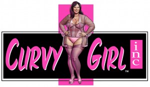
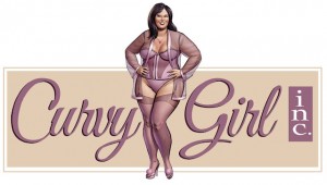
So, we have a couple of treatments for a logo we are considering for a new website we are calling www.CurvyGirlInc.com – it’s live but not too much there, yet. So stay tuned for that.
But, we’d love to hear from you. Which logo do you prefer? If you can comment in our blog below here with your vote for #1 or #2. You can share with us why you like the one you like, too, if you have the time.
Thank you for all of your love and support always!
Blissfully, Chrystal Bougon
#1 Hot Pink and Black with “maroon” font curvy girl logo:
#2 Mauve and purple Curvy Girl logo:
P.S. Sadly, we will not be able to have any sex toys in our store. Just lingerie, sexy shoes, gifts an stockings. We will be able to have some of our BlissConnection goodies on display – like the Eros Lube, the Coochy Rash Free Shave Cream and our edible Making Love Massage oils. But no sex toys. It’s just not allowed in Willow Glen.
And, if it all works out, it will be on Meridian Ave – so keep your fingers and toes crossed for us. We will keep you posted!


{ 22 comments… read them below or add one }
#2
Thank you Margaret.
#2 very classy #1 is too bright in coloring 🙂
Love them both buy I have to agree with the other voter so far that #2 is far more classy! Love #2.
Hi there, #1 reminds me of “Freddricks”, Which is everywhere……
I prefer number 2, but, I might suggest a border around the sign of a deep purple just to make it visually pop a little….?
I like #2.
#2. Much classier of the two choices. Good luck with the store opening!!
Definitely #2
Definitely #2…looks classier and less intimidating if that makes sense… 😉
#2 gets my vote
#2, I dont like the panties on #2, to me the panties make her look chunky not curvy sexy which is my fear everytime I put on sexy panties. Let me know when it opens I will definatly be shopping!
I meant I dont like the panties on #1. Sorry
I love #2. I’m so excited for this store and for you! Best wishes!
Wasn’t sure if jut clicking on the image is counted as a ‘vote’.
If not, I like the mauve one…
#2
I like logo #2. It looks very sexy and classy.
#1. It says I am a cury girl with a kinky side and proud of it. The other looks like some where that my grandma might shop. I believe it depends on who your target customer.
Chrystal, I’m in awe of your ambition, drive and passion! I’m proud to know you and to witness the transition of having a dream come that much closer to reality. That said, my vote is for # 2 – I love the colors and the font. It’s a much more smooth, seductive and soft logo than the 1st, which I like for the store-type. Big encouraging hugs from me!
#1
#2
i like #2, but the hair for #1 is AWESOME.
Aloha, Chrystal! Congratulations on being so close to realizing your dream! #2 is my favorite – sexy, elegant… curvy. 🙂