 Curvy Girl Inc
Thank you so much for all of your ideas for our new Curvy Girl tag line. Big thank you to Dana, Shelley and Gina – they each won a Bliss Romance Package for their awesome tag line submissions for our Curvy Girl Lingerie store.
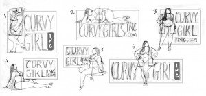
We are seriously considering opening a Curvy Girl Lingerie store in Willow Glen in the San Jose area and we would love your opinions on the Curvy Girl logo sketches from the amazing Les Toil – check out his other Toil Girls on his portfolio website here.
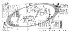
Here are the 6 options for a possible logo for our plus size lingerie store. (And, we will be carrying shoes for all sizes. And gifts that are great for birthday parties, bachelorette parties, too.
Would you tell us your two favorite logos in our blog comments. If you have a moment, tell us WHY you like those two, as well. We appreciate your help with this! Your opinion matters to us.
 CurvyGirlInc.com
We will keep you posted about our progress on our Facebook page for BlissConnection.com – www.Facebook.com/BlissConnection but we do plan to build a separate fan page for Curvy Girl, too.
Thanks for all of your LOVE and support. This is going to be fun!


{ 49 comments… read them below or add one }
I like #3 the best. I like that it is square and fits as a logo well and that the figure is only slightly beyond the box. I also like that she is forward facing and “owning” her sexiness. It says to me “I look hot in this, don’t you think?”
#6 or 3 are the strongest alone and will look best across multiple uses.
My sister likes 3 and 6 the best. I like 6 the best. I like the front view versus the provile views. I agree with Adam — 3 will be easiest to use for many things. Our own shop logo is horizontal like 6, and it limits us when we need to use our logo for thumbnails on Facebook, Twitter, etc. because it either needs to be shrunk down really small or I can only use part of it, so that the Ohana part of our logo can be seen. Good luck!
I just like #3 bext
it’s Dani D
I like #3 best, second choice #6
I like #3 and #6 the best. I don’t like the girls lying down. Prefer the ones where they are standing. Looks more sophisticated to me.
#6 is my fav. Like the idea of number three (square format and more “self contained” look of overall logo) but the dark hair makes logo look unbalanced (at, to me it does!) Maybe if the text were darker the hair would work better. At the moment 6 is my fav because overall logo looks balanced and I like the positioning of the figure – she’s got a nice bit o’ “sassy” going on with her hands on her hips and her “look at me” stance
I like the position and stance of #6 hands down. She comes across as totally sensuous, self-confident, fully her own self. (I don’t get the same sense or mood from the profiles). Would like to see #6 image in the #3 layout so it’s more concentrated visually. And maybe play with softening the edges of the ‘box’ so it’s not a solid outline or so squared up or boxy. Just a thought in keeping the overall look be soft and curvy.
I like #3 and #5 the best, I don’t know why, those are the ones that spoke to me…
I like #3 best!
First choice – #6 and my second choice is #3.
I like 1 and 6. Nice job on the logos!
#3 and #6, there is a boldness and sexy-ness to the both of them. Much more eye catching than the others.
#3 and #6 are my faves!
3 and 5.. I feel they are sexy without being too sexy on a store front. All of them are great but those are absolutely my favs!
How exciting! A store front! My favorite is #3 confident and sexy. Rounding the corners on the box containing the writing would emphasize the curves.
3 and 6 are my choices – I agree with the comments about the confident standing poses and the comments about the usability of the logo for various media – congratulations Chrystal!
When I grow up I want to be a Curvy Girl Model=)
I like 3 the best followed by #6, but would prefer the inc. part to be like in #2. #3 is my favorite because she looks strong, confident, sure of herself & her curves. Her stance is powerful. Love this whole idea!
I like #6–it’s a pose in my biz I call “covergirl”. Everyone loves it because it’s instantly recognizable as a feminine, hourglass-y look. Also VERY confident and strong. xo
I like 3 and 6 the best. I like how the girl is facing forward with her hands on her hips, very confident, sexy and sassy. You might have the best practical application use with #3 though because it’s square. As Three Girls’ logo is horizontal, sometimes it doesn’t work well on sites or other places and we have to crop it which doesn’t look good. I also like what some of the other comments have suggested about possibly softening the corners of the square box so they’re a little ‘curvy’ too. Congrats and GOOD LUCK!
Great concept and logo design! My vote is for #3 & #6. Both images show confidence, sassiness, class, and a bit of attitude. Not having a box would be better (in my opinion) but if you need one then round the corners.
6 seems to be the heavy favorite. thanks kim.
thank you so much for your vote!
Thank you so much Maaliea. Number 6 seems to be the big favorite.
Thanks Tami. 6 is the big front runner.
Thank you. Number 6 seems to be running away with it.
Thanks sylvia
Those two seem to be the favorites lauren.
Thanks so much for your feedback.
Thanks so much Tamara. #6 seems to be running away with it.
Thank you, Lisa. I appreciate your feedback.
Cool. Thanks Lindsay. Those are definitely the two running away with it. 6 is the big leader.
Thank you DD!
Thanks so much.
Thanks Adam.
Thank you for your feedback, mucho appreciated.
Thanks so much Caroline.
Awesome, Erika. Thank you so much.
Thanks Jillian. 6 is the heavy favorite and my favorite, too.
Thank you for commenting, Leslie.
You may get your shot, Aeriol!
Thank you so much Debbie. 6 is the likely winner.
Thanks so much Liz. cb
#6 is my favorite!
Thanks Carla. She is leading the race that is for sure.
Good suggestion!
I like logo #2 better. It looks very classy and sexy.